Project information
- Category: Rating site, user interviews, user testing, all design
- Client: Hanover Insurance
- Project date: 2015
The Project
Due to losses and vulnerabilities of the current system, a new site needed to be built so that users did not have to rely on several access data bases and manual processes that were cumbersome and ineffective.
The Assessment
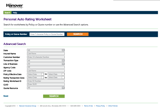
The site was completely set up when I was approached to consult (as seen in the image above). Several developers and tech leads had set up the new tech/data approach. While most of the data issues had been solved, the interface they had constructed had a lot of dead ends and redundancies, and it was pretty far off-brand. No users liked it.
The Strategy
This had a tough timeline and I had to really focus on ‘the low-hanging fruit’ because there were not a lot of resources. After understanding the purpose and scope of the project, I focused on the groups using the site and what other sites and applications they would be using with it. It was these conversations that helped the project and tech leaders understand what they weren’t seeing. The example above shows how there were two pages to get through before finding what you needed—a policy or quote number search result.
The Content
After all of the talks about what exactly the user was looking for and where they were looking for it, we were able to eliminate the first page altogether and land them on a ‘homepage search’ which was basically a single field for a policy or quote number. We had several roles to consider on this page, so we offered an advanced search as well that could filter search results and also added more specific fields for specialized users. We also introduced a navigation bar so that this page could always be accessed and also so future pages could be introduced. On the rest of the pages we discovered a need for printing the results or exporting to excel—even comparing some results to easily see differences.
The Results
The site improvements were notable to the test users and we were able to integrate ANOTHER project into this one seamlessly because of the redesigned architecture and ease-of-use (and maintenance). Ultimately, we were able to enhance all the great back-end changes with some front-end usability, and the test users were able to understand the new site much better. The image below shows the new ‘search landing page’ and a few more before and after pages for this project.


